Whenever popular sites and apps make major changes to their platform UI, it doesn’t go well with their power users. YouTube is receiving flak from its users due to a design overhaul to its website. The video-sharing site has been conducting split testing and has implemented a change to the comment section.
The new design has shifted the YouTube comments to the right side of the video player replacing the recommended videos. All the video recommendations now appear at the bottom of the current video you are watching. The new layout may be favorable during YouTube live streams but for regular viewing, it can be distracting.
A majority of users want to go back to the old YouTube UI where comments appear at the bottom and the recommended videos are on the side of the video. In this guide, I have explained some interesting tricks to fix the YouTube comments on the right side.
Turn Off YouTube Experimental Feature
As I said, the changed UI on YouTube is a part of YouTube’s A/B testing. If you use YouTube Premium, it is possible to enable or turn off experimental features that YouTube usually rolls out to its premium user base.
- Open YouTube on your PC browser.
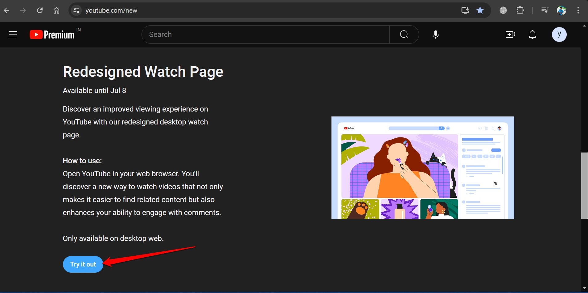
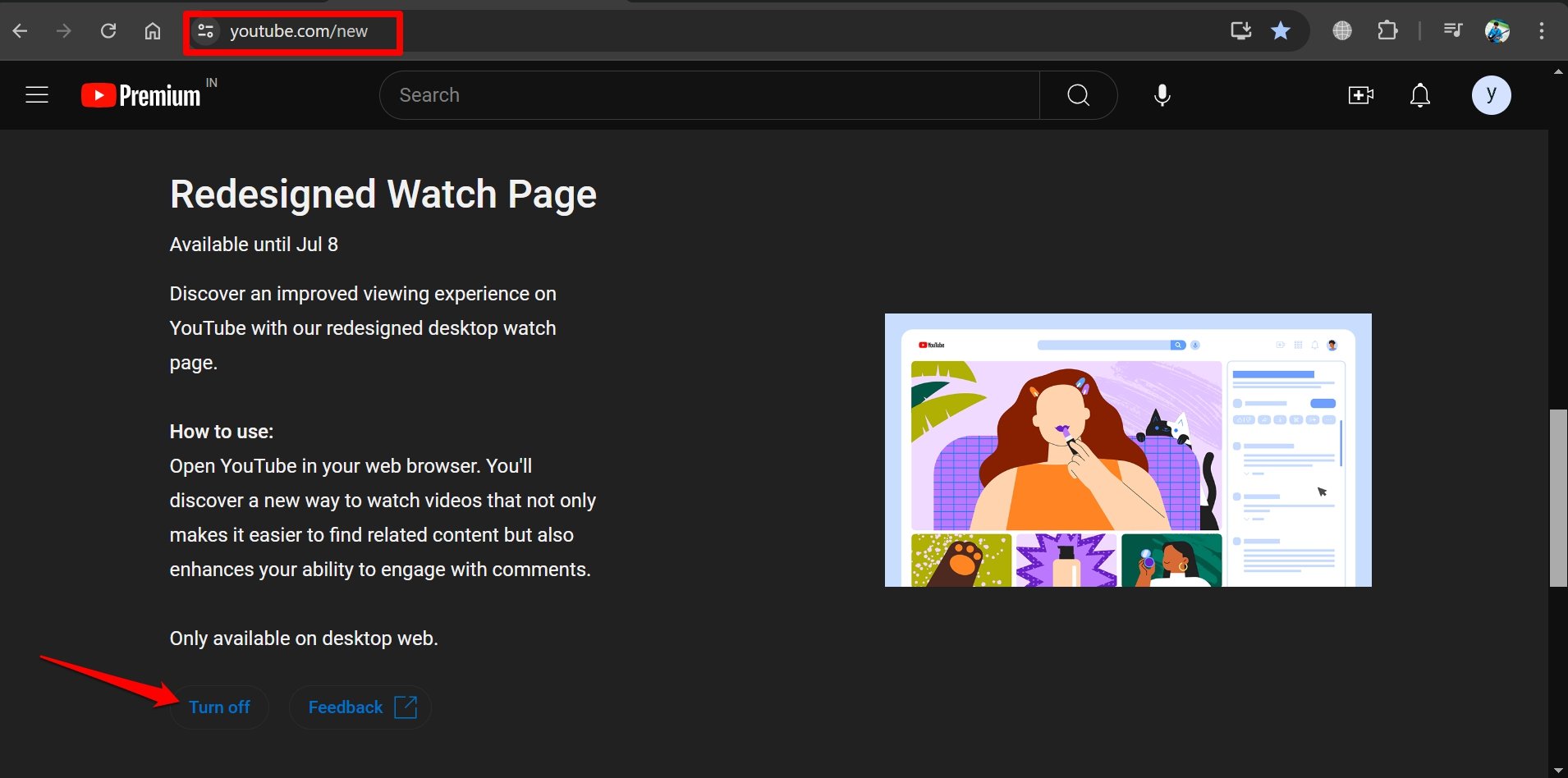
- In the URL bar, enter youtube.com/new to visit the YouTube Labs.
- If you want to turn on the redesigned watch page on YouTube, click Try it Out.

- To disable the feature, press Turn Off.

Note: The redesigned watch page experimental feature is available till July 8th, 2024 for YouTube Premium users.
If you are without a premium subscription on YouTube, the redesigned layout of the watch page may be randomly rolled out to your account. The comment section is on the right side and recommended videos are at the bottom of the current video being played.
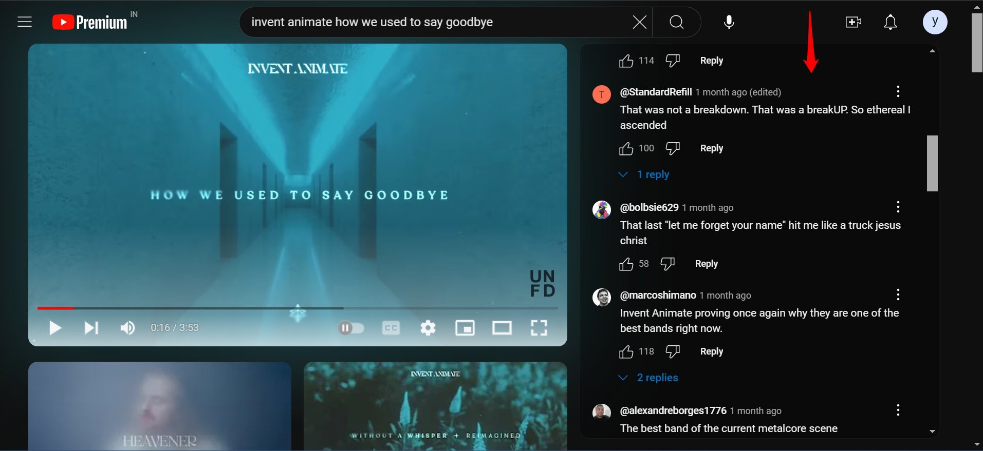
Without being a YouTube Premium user, you cannot turn off the Redesigned Watch Page feature manually. There are other workarounds you can implement which I have discussed in the next section of this article.
Use uBlock Extension to Change the YouTube UI
Lots of YouTube users who are fed up seeing the comment section on the right side are using the uBlock extension. This plugin allows the users to set a custom filter to use YouTube with its old UI.
You can change the YouTube layout back to its previous interface with the comment section at the bottom and recommended videos on the sidebar.
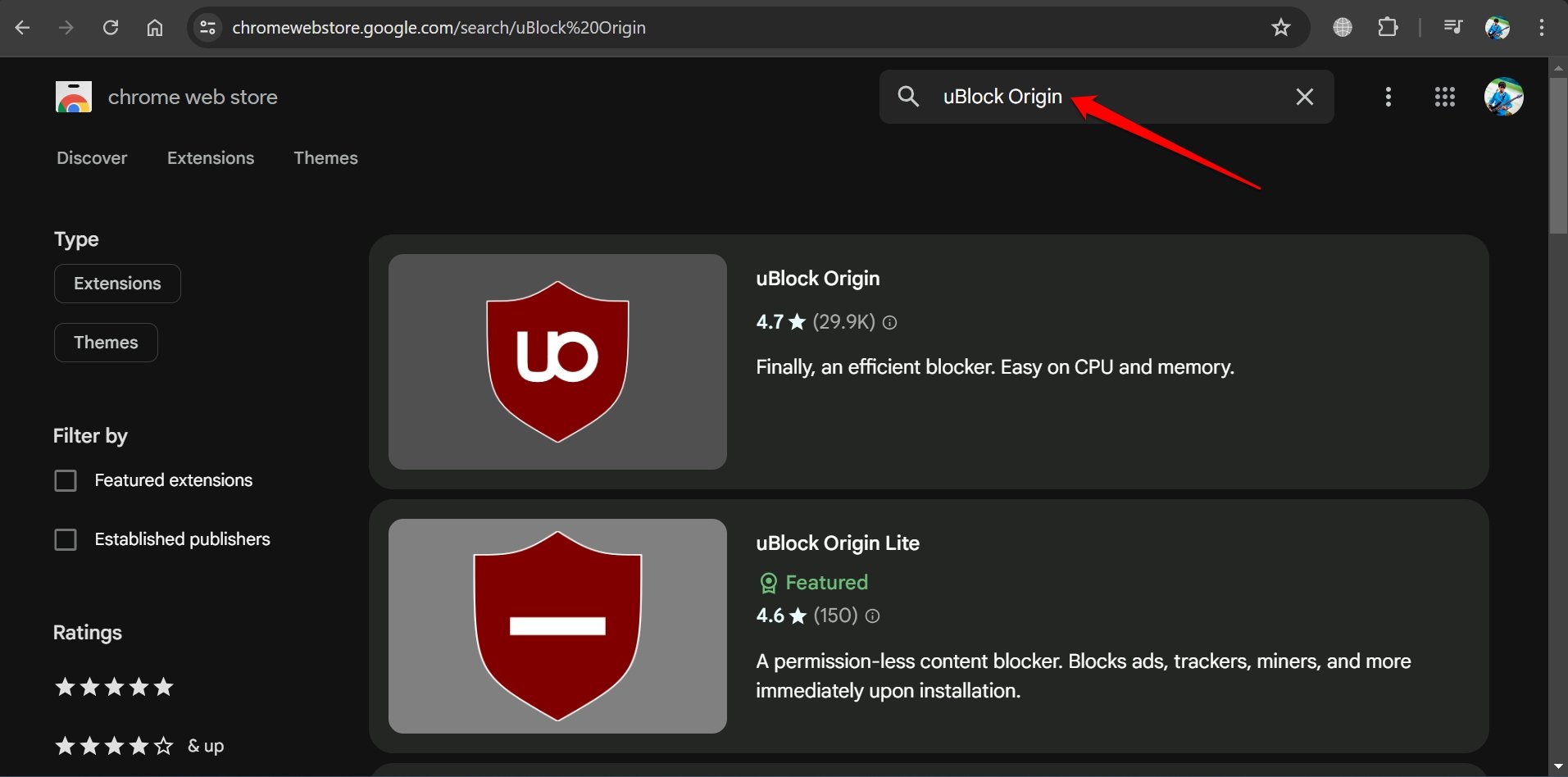
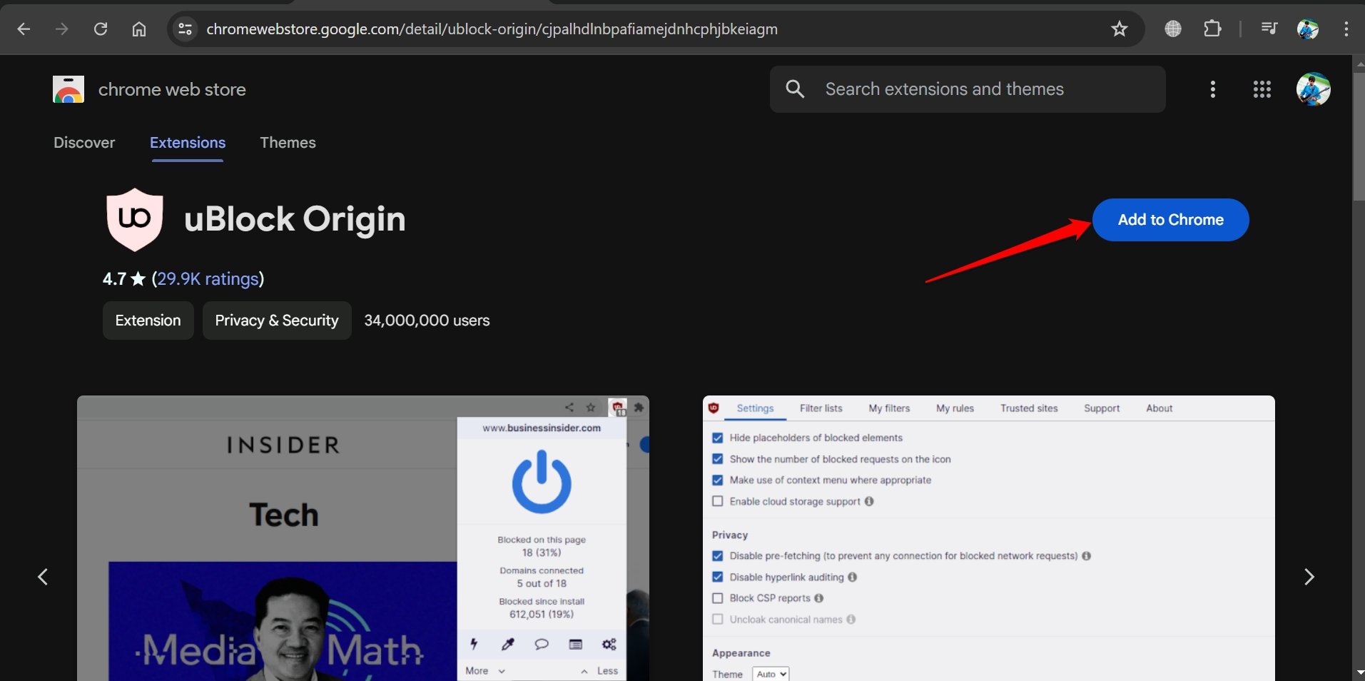
- On your browser, go to Chrome Webstore.
- Search for uBlock Origin.

- Click Add to Chrome.

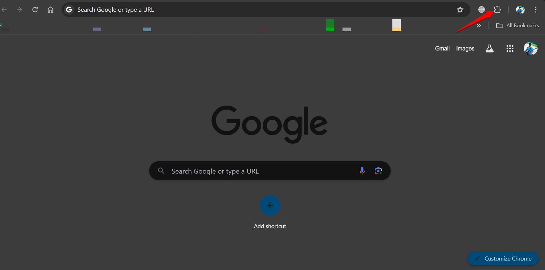
- Next, click the Extensions icon beside the Chrome URL bar.

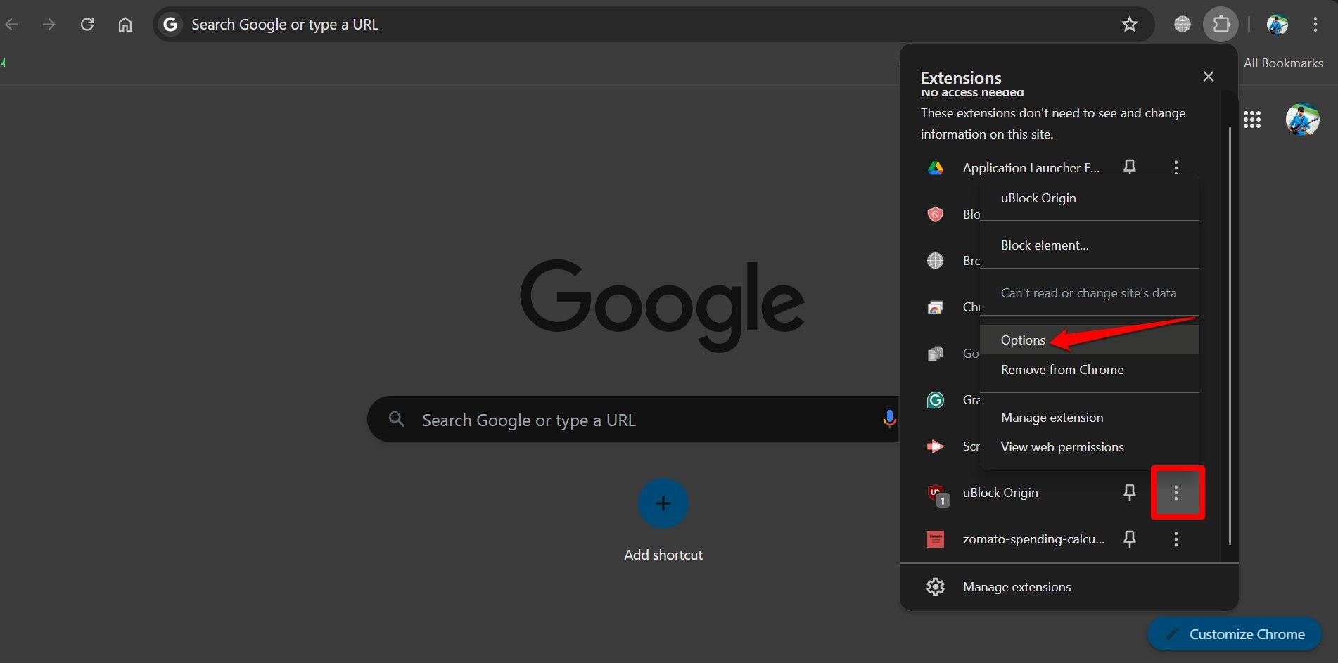
- Go to uBlock Origin and click the 3-dot icon to expand the menu.
- From the menu, select Options to access the uBlock Dashboard.

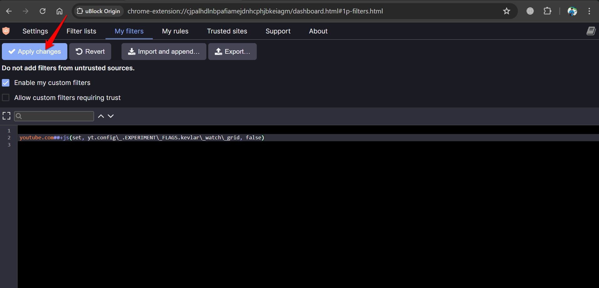
- Switch to the tab My Filters.
- Paste this script in the text editor.
youtube.com##+js(set, yt.config\_.EXPERIMENT\_FLAGS.kevlar\_watch\_grid, false)
- Click Apply Changes and relaunch Chrome.

- Launch YouTube and play any video.
Check if the comment section still appears on the right side. The comments should now appear on the bottom and the recommended videos should appear on the right side.
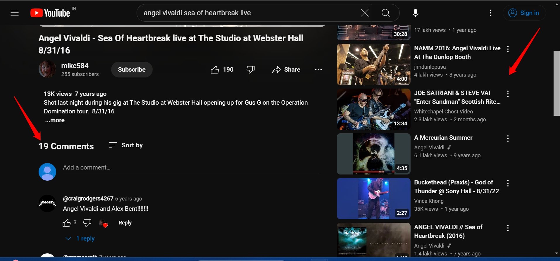
NOTE: If you have YouTube Premium and enabled the Redesigned Watch Page, then this workaround with uBlock Origin will not work.
Delete YouTube Website Cookies
Some users have stressed the fact that clearing the website cookies can revert the YouTube watch page to its older layout with comments at the bottom and recommended videos listed on the right.
On Chrome
- Launch YouTube on the browser.
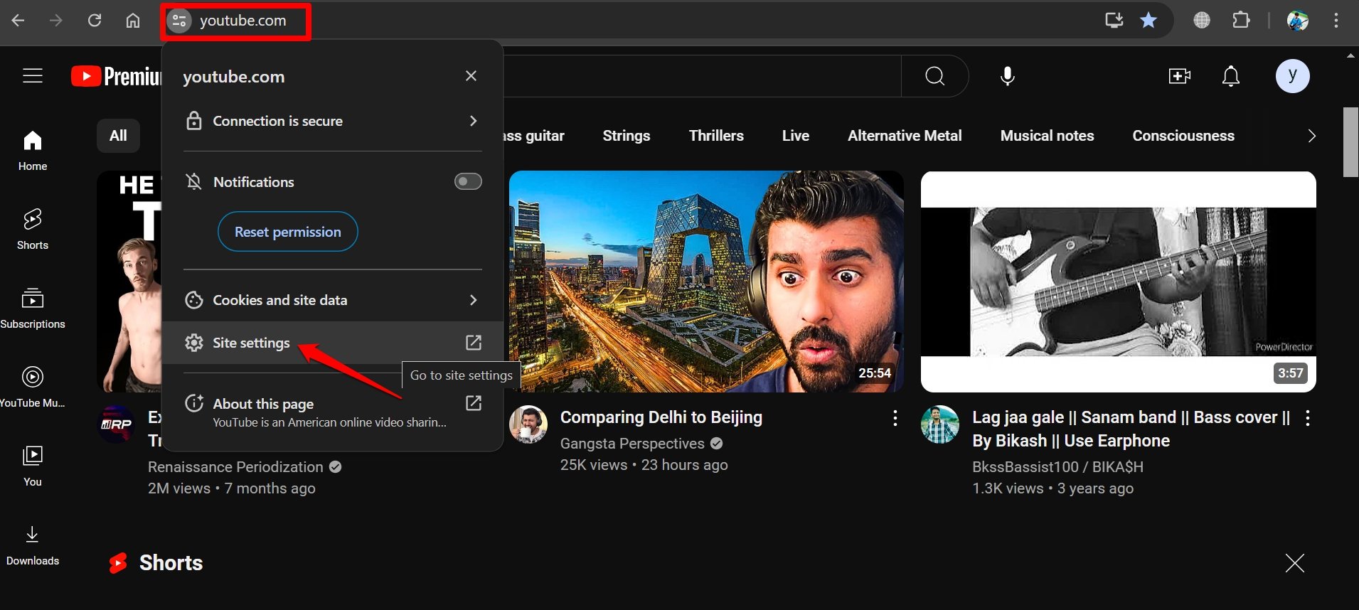
- Click the settings icon beside the URL bar.
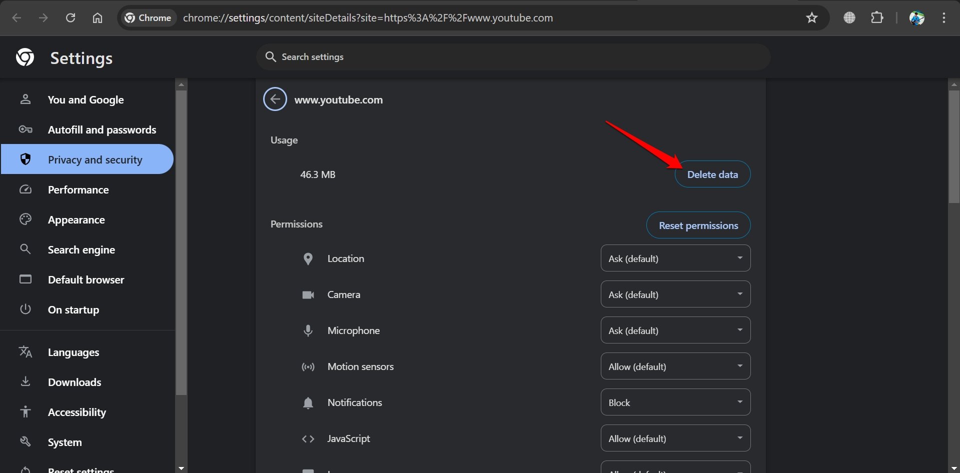
- Select Site Settings.

- Click Delete Data.

On Firefox
- Open the Firefox browser and access the YouTube website.
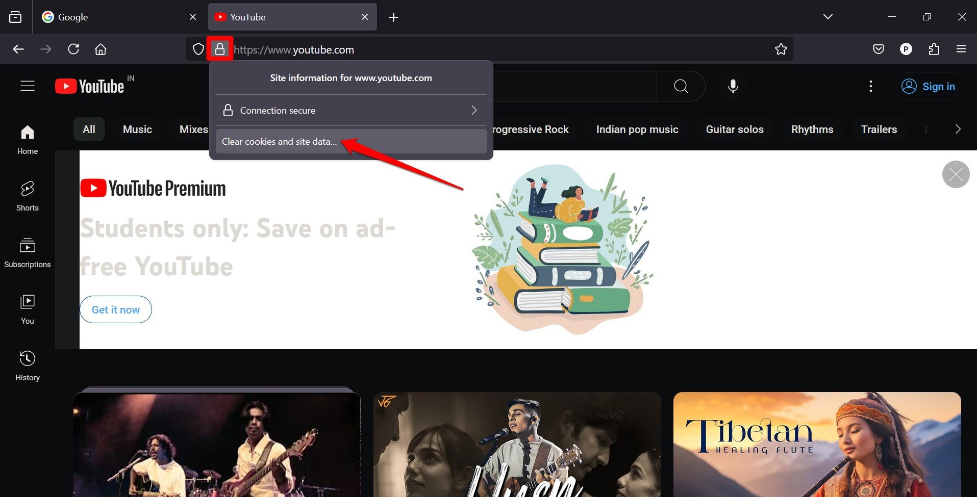
- Click the padlock icon in the URL bar and select Clear Cookies and Site Data.

- Press Remove on the confirmation dialog box.

On Edge
- Launch YouTube.
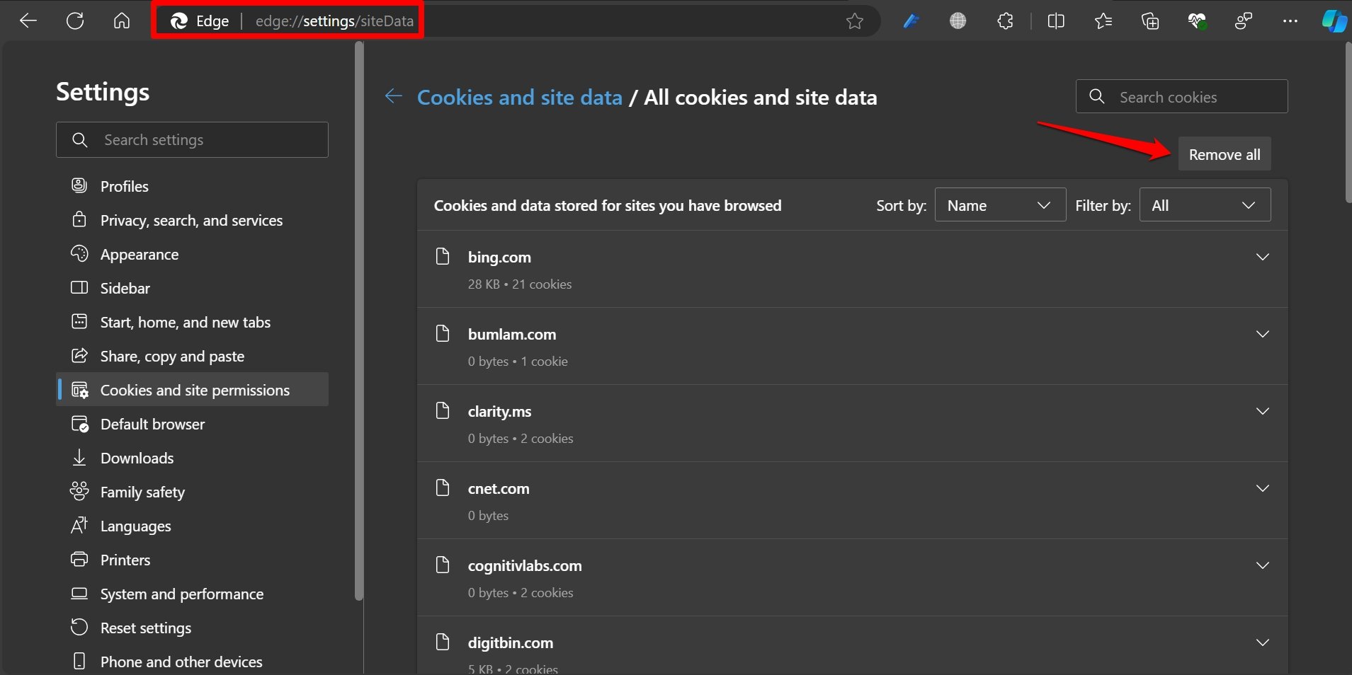
- In the URL bar type edge://settings/siteData
- Under All Cookies and Site Data, click Remove All.

After clearing the YouTube site data, relaunch the browser you use. Play a video on YouTube and check if the comment section is appearing at the bottom of the video player.
Send Feedback to YouTube
A website/app is made of its user base. Every digital product allows its users to send feedback on their user experience on the platform.
You can share feedback regarding your negative experience with the YouTube redesigned watch page that shifts the comment section to the side and recommended videos at the bottom.
To share your feedback directly with YouTube,
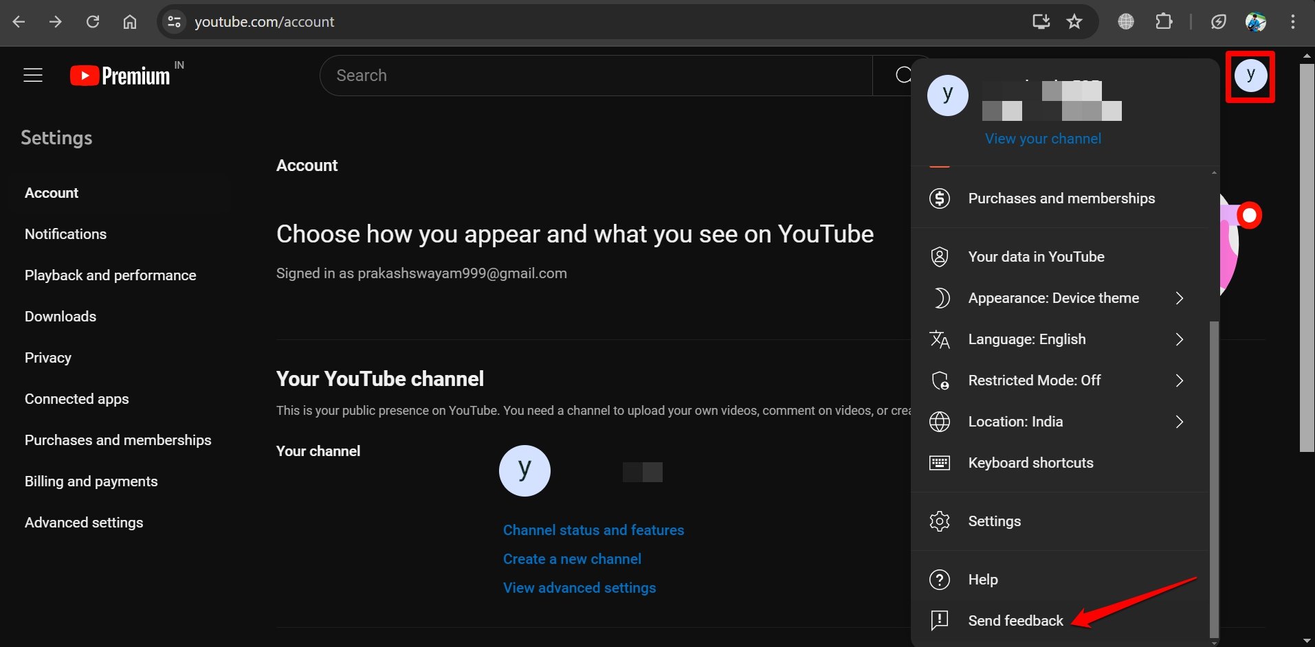
- Launch YouTube on your browser and sign in to your account.
- Click the profile avatar and select Send Feedback from the menu.

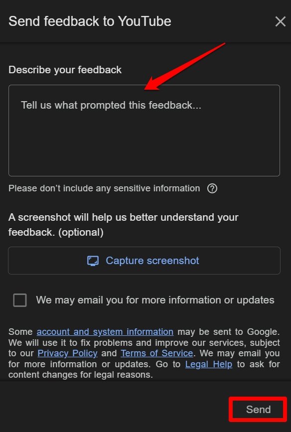
- Explain the issue with the redesigned watch page comment section in the Describe Your Feedback segment.
- Share screenshots to support your feedback.
- After adding all the necessary information, click Send to share your feedback.

Bottom Line
If you are more comfortable using the older watch page of YouTube with comments at the bottom, these tips and tricks will help you change the UI. YouTube premium users can manually turn off the redesigned watch page. Other users can implement the script on uBlock Origin to switch to the older UI.
With a majority of users finding the new YouTube watch page layout an eyesore, I’m hoping YouTube to change the comment section back to the bottom once their testing phase is over. Constantly bombarding YouTube with negative feedback regarding the watch page can surely do the trick.
If you've any thoughts on [Fix] YouTube Comments on Right side and Recommendations on Bottom, then feel free to drop in below comment box. Also, please subscribe to our DigitBin YouTube channel for videos tutorials. Cheers!
